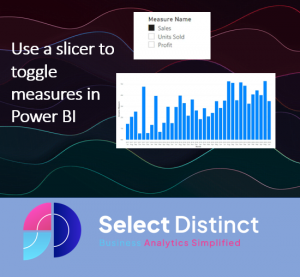
Space on your dashboards is a limiting factor
To make the best use of limited space setting up toggle measures in Power BI helps to use the space better
One of the key challenges with dashboard building is finding the balance between detail and available space
This article shows you how to combine a couple of features to create the ability to toggle measures in Power BI
You may want to show sales amount, units sold or profit depending on the selection of a slicer.
We want to give the user an easy option to switch between measures using a slicer
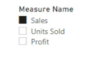
This will allow the users to toggle between measures to see which of these measures they choose without having to squeeze all of the data on screen at the same time
How can you achieve this in Power BI?
One way to do this is to use the SWITCH function, which is a kind of logical function, similar to CASE statements in SQL or nested IF statements, that evaluates an expression against a list of values and returns one of multiple possible result expressions.
The syntax of the SWITCH function is:
SWITCH(<expression>, <value>, <result> [, <value>, <result>]… [, <else>])The parameters of a SWITCH function are:
- expression: Any DAX expression that returns a single value
- value: A target value
- result: The output to be calculated if the target value is met
- else: An alternative value if none of the target values are met
Let’s see how we can use the SWITCH function to toggle measures in Power BI.
Step 1: Create a slicer with three options
First, we need to create a slicer that will allow us to choose between three options: Sales, Units Sold and Profit.
Create the list of options for the slicer
Begin by adding a new table to store the names of each measure you want to select from
On the data pane, click enter data
Double click the first column name and edit it to ‘Measure Name’
and add a second column to define the sort order you want the rows to appear on a slicer, we want Sales to appear first so we have set that as option number one
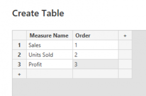
Then name this table ‘Measure List’ and click load
Step 2. Add the slicer for the toggle switch
Click on the slicer icon and a slicer is added to the canvas
Drag the newly created field ‘Measure Name’ to the slicer
By default the Measure names will be sorted in value order, but we want to sort by the Order column
To resolve this, go to the data pane, select the measure names field and set it to sort by the order column
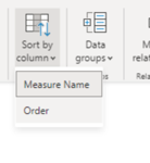
Your slicer should look like this

The slicer now has the options in the correct order, but it does not have any purpose as yet
Step 3: Define the rules for the SWITCH
We added a new measure for the chart which is controlled by the slicer
Add a new measure and insert this DAX code
Dynamic Measure =

SWITCH (

TRUE (),

SELECTEDVALUE('Measure List'[Measure Name]) = "Sales", sum('Sales Summary'[ Sales]),

SELECTEDVALUE('Measure List'[Measure Name]) = "Units Sold", sum('Sales Summary'[Units Sold]),

SELECTEDVALUE('Measure List'[Measure Name]) = "Profit", sum('Sales Summary'[Profit]),

0

)
The formula does the following:
- It creates a variable called SelectedValue that stores the value of the selected option in the slicer using the SELECTEDVALUE function.
- It uses the SWITCH function to return either sales amount, units sold or profit based on the value of SelectedValue.
- if the SelectedValue does not match any of the options then the ELSE case at the end is set to return a zero
Now we can use the measure in a visual
Add the Dynamic Measure field to the Y axis on a column chart, just as you would if you wanted to chart sales by month
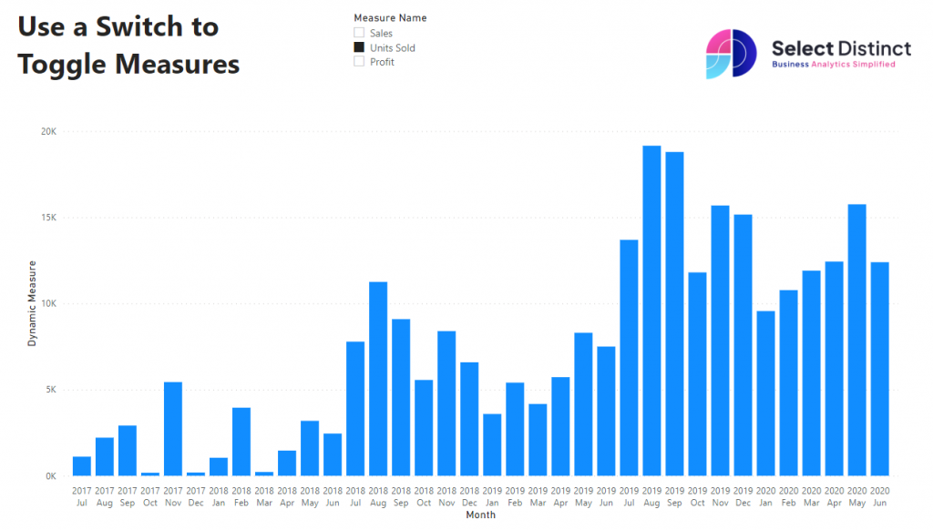
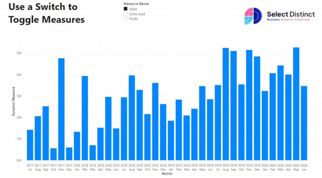
The column chart presents this quite well,
but you can use this with any visual that supports measures instead
Conclusion
In this blog post, we learned how to use the SWITCH function to toggle measures in Power BI.
We saw how we can combine this with a slicer with three options and use it as a toggle for the SWITCH function.
Our experience of using this for our clients has often been met with great feedback such as “I love that toggle button!” or “I never realised you could switch between measures”
Subscribe to our channel to see more tips and timesavers
Select Distinct YouTube Channel
Or find other useful SQL, Power BI or other business analytics timesavers in our Blog
Our Business Analytics Timesavers are selected from our day to day analytics consultancy work. They are the everyday things we see that really help analysts, SQL developers, BI Developers and many more people.
Our blog has something for everyone, from tips for improving your SQL skills to posts about BI tools and techniques. We hope that you find these helpful!

